Apple doesn't care about Album Cover Art
It doesn’t. It’s the only possible explanation.1
This is my iPod Touch from 2012:
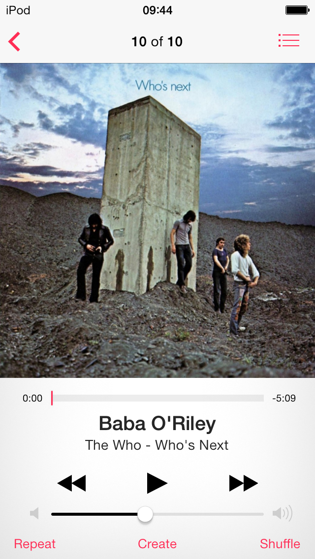
This is my iPhone SE from 2016 (which I’m still rocking to this day):
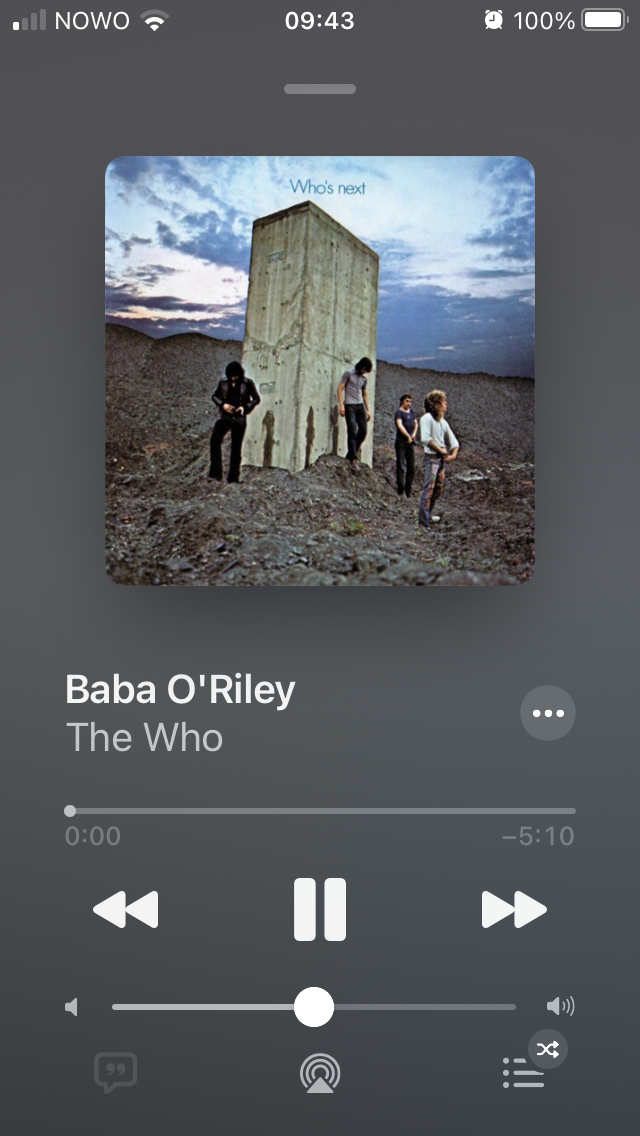
Look at the size of this album cover. Why isn’t it touching the edges of the screen? Why can’t I read the album name from the cover?2 And why can’t I see that The Who took a piss on the monolith?
Oh, and if you pause the player the image gets even smaller:
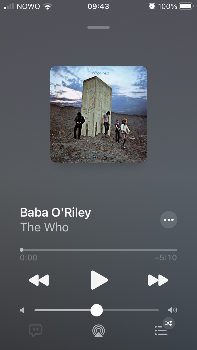
Why? So much creativity, imagination and artistry thrown in the bin for no good reason.
One more example. This is my iPod Touch’s lock screen:

And this is my iPhone’s:
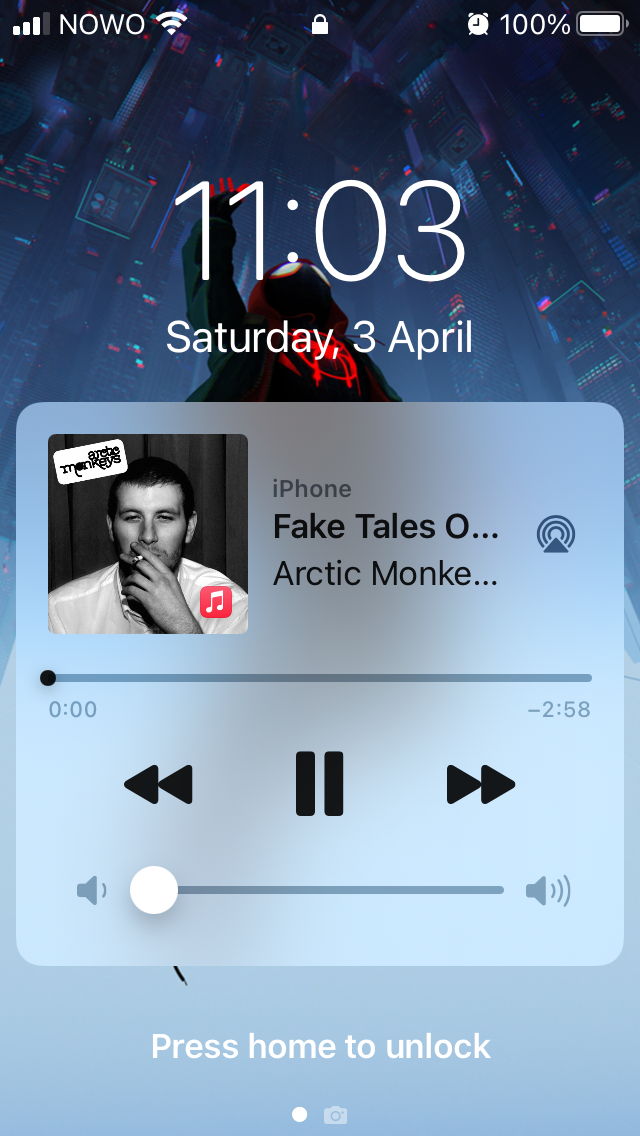
I know that an iPhone is more than an iPod. Showing a customizable background in the lock screen is a plus for personalization and individuality. Showing the day of the month and of the week is useful. I get it.
But why is “iPhone” written above the name of the song? What is the airplay icon doing there? Why can’t I read the name of the band? Why can’t I read the name of the song?! And why is the cover so, so small?
What’s more galling is that this is coming from the company that invented (or at least made popular) Cover Flow.
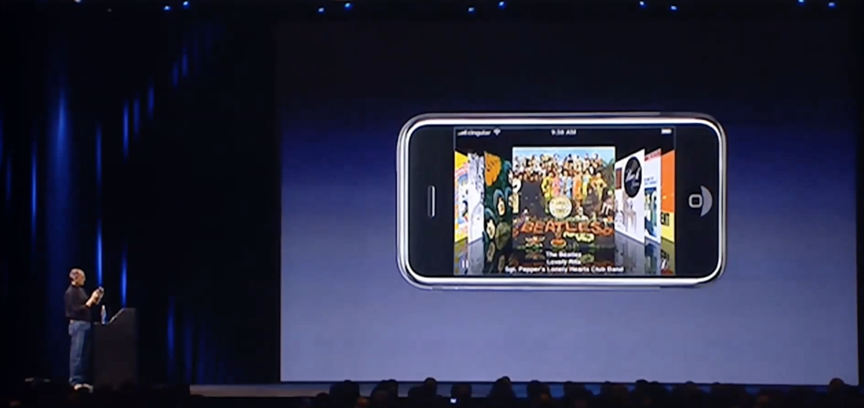
I’d be lying if I didn’t admit that this wow factor was a key point in my decision to buy an iPod Touch when it came out. Now, Cover Flow no longer exists and cover art has never been smaller.
The fact of the matter is that nobody cares about cover art. Including the company that invented the iPod.
-
Well, another possible explanation is that Apple doesn’t care about small iPhones anymore. It’s probably both. ↩
-
And why can’t I see the album name anywhere on the UI? ↩